Lesson 17
Pearson’s Correlation Coefficient
Outline
Measures of Relationships
Pearson’s Correlation Coefficient (r)
-types of data
-scatter plots
-measure of direction
-measure of strength
Computation
-covariation of X and Y
-unique variation in X and Y
-measuring variability
Example Problem
-steps in hypothesis testing
-r2
Note that some of the formulas I use differ from your text. Both sets of formulas are in the homework packet, and you should use the formulas you feel most comfortable using.
Measures of Relationships
Up to this point in the course our statistical tests have focused on demonstrating differences in effects of a dependent variable by an independent variable. In this way, we could infer that by changing the independent variable we could have a direct affect on the independent variable. With the statistics we have learned we can make statements about causality.
Pearson’s Correlation Coefficient (r)
Types of data
For the rest of the course we will be focused on demonstrating relationships between variables. Although we will know if there is a relationship between variables when we compute a correlation, we will not be able to say that one variable actually causes changes in another variable. The statistics that reveal relationships between variables are more versatile, but not as definitive as those we have already learned.
Although correlation will only reveal a relationship, and not causality, we will still be using measurement data. Recall that measurement data comes from a measurement we make on some scale. The type of data the statistic uses is one way we will distinguish these types of measures, so keep it in mind for the next statistic we learn (chi-square).
One feature about the data that does differ from prior statistics is that we will have two values from each subject in our sample. So, we will need both an X distribution and Y distribution to express two values we measure from the same unit in the population. For example, if I want to examine the relationship between amount of time spent studying for an exam (X) in hours and the score that person makes on an exam (Y) we might have what is shown in Table 1.
Table 1
| X | Y |
| 2 | 65 |
| 3 | 70 |
| 3 | 75 |
| 4 | 70 |
| 5 | 85 |
| 6 | 85 |
| 7 | 90 |
Scatter plots
An easy way to get an idea about the relationship between two variables is to create a scatter plot of the relationship. With a scatter plot we will graph our values on an X, Y coordinate plane. For example, say we measure the number of hours a person studies (X) and plot that with their resulting correct answers on a trivia test. (Y) and compile them as in Table 2.
Table 2
| X | Y |
| 0 | 0 |
| 1 | 0 |
| 1 | 2 |
| 2 | 3 |
| 3 | 5 |
| 4 | 5 |
| 5 | 6 |
Plot each X and Y point by drawing and X,Y axis and placing the x-variable on the x-axis, and the y-variable on the y-axis. So, when we are at 0 on the X-axis for the first person, we are at 0 on the y-axis. The next person is at 1 on the X-axis and 1 on the Y-axis. Plot each point this way to form a scatter plot.
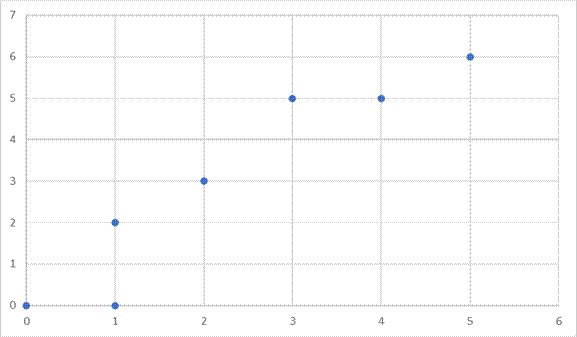
In the resulting graph you can see that as we increase values on the x-axis, it corresponds to an increase in the y-axis. So, as we move to the right of the graph, the plotted points are higher and higher on the graph. For a scatter plot like this one we say that the relationship or correlation is positive. For positive correlations, as values on the x-axis increase, values on y-increase also. So, as the number of hours of study increases, the number of correct answers on the exam increases. The opposite is true as well. If one variable goes down the other goes down as well. Both variables move in the same direction.
Let’s look at the opposite type of effect in Table 3. In this example the X-variable is number of alcoholic drinks consumed, and the Y-variable is number of correct answers on a simple math test.
Table 3
| X | Y |
| 1 | 10 |
| 2 | 9 |
| 2 | 8 |
| 3 | 5 |
| 4 | 6 |
| 5 | 3 |
| 7 | 3 |
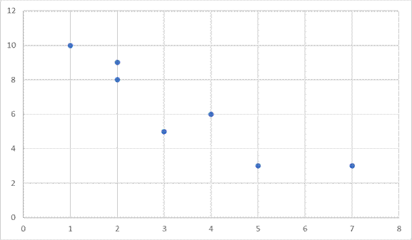
This scatter plot represents a negative correlation. As the values on X increase, the values on Y decrease. So, as number of drinks consumed increases, number of correct answers decreases. Here, starting on the left side, we have high numbers when we are low on the x-variable and the numbers move down as we move to the right on the x-variable. The variables are moving in opposite directions, such that as one increases the other decreases.
Measures of Strength
Scatter plots gave us a good idea about the measure of the direction of the relationship between two variables. They also give a good idea of how strongly related two variables are to one another. Notice in the above graphs that you could draw a straight line to represent the direction the plotted points move.
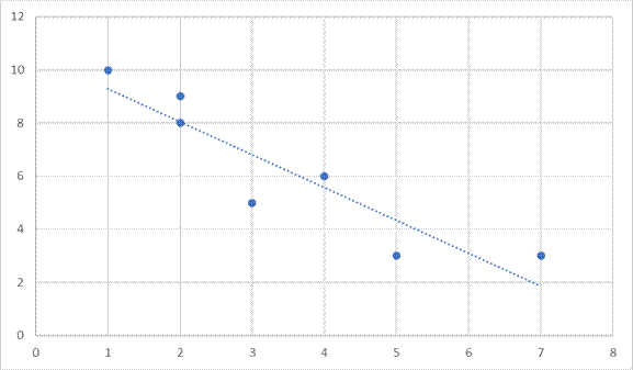
The line we are drawing does not touch most points we have plotted on the graph, but they come as close to each of the points as possible with a straight line. The closer the points line up to this straight line, the stronger the relationship. We will express the strength of the relationship with a number between 0 and 1. A zero indicates no relationship, and a one indicates a perfect relationship. Most values will be a decimal value in between the two numbers. Note that the number is independent of the direction of the effect. So, we may express a -1 value indicated a strong correlation because of the number and a negative relationship because of the sign. A value of +.03 would be a weak correlation because the number is small, and it would be a positive relationship because the sign is positive. Here are some more examples of scatter plots with estimated correlation (r) values.
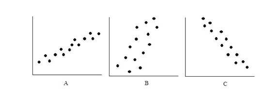
Graph A represents a strong positive correlation because the plots are very close together (perhaps r = + .85). Graph B represents a weaker positive correlation (r = +.30). Graph C represents a strong negative correlation (r = -.90).
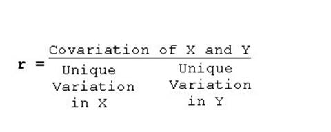
Computation
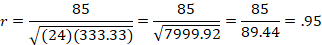
When we compute the correlation it will be the ratio of covariation in the X and Y variable, to the individual variability in X and the individual variability in Y. By covariation we mean the amount that X and Y vary together. So, the correlation looks at the how much the two variables vary together relative to the amount they vary individually. If the covariation is large relative to the individual variability of each variabile, then the relationship and the value of r is strong.
A simple example might be helpful to understand the concept. For this example, X is population density and Y is number babies born.
Individual variability in X
You can think of a lot of different reasons why population density might vary by itself. People live in more densely populated areas for many reason including job opportunities, family reasons, or climate.
Individual variability in Y
You can also think of a lot of reasons why birth rate may vary by itself. People may be influenced to have children because of personal reasons, war, or economic reasons.
Covariation of X and Y
For this example it is easy to see why we would expect X and Y to vary together as well. No matter what the birth rate might happen to be, we would expect that more people would yield more babies being born.
When we compute the correlation coefficient we don’t have to think of all the reasons for variables to vary or covary, but simply to measure the variability. How do we measure variability in a distribution? I hope you know the answer to that question by now. We measure variability with sums of squares (often expressed as variance).
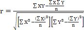
So, when we compute the correlation we will insert the sums of squares for X and Y in the denominator. The numerator is the covariation of X and Y. For this value we could multiply the variability in the X-variable times the variability in the Y-variable, but see the formula below for an easier computation.
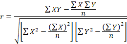
The only new component here is the sum of the products of X and Y. Since each unit in our sample has both and X and a Y value, you will multiply these two numbers together for each unit in your sample. Then add the values you multiplied together. See the example below as well.
Example Problem
The following example includes the changes we will need to make for hypothesis testing with the correlation coefficient, as well as an example of how to do the computations.
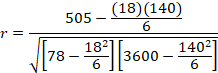
Below in Table 4 are the data for six participants giving their number of years in college (X) and their subsequent yearly income (Y). Income here is in thousands of dollars, but this fact does not require any changes in our computations. Test whether there is a relationship with Alpha = .05.
Table 4
| # Years of College (X) | Income (Y) | X2 | Y2 | ΣXY |
| 0 | 15 | 0 | 225 | 0 |
| 1 | 15 | 1 | 225 | 15 |
| 3 | 20 | 9 | 400 | 60 |
| 4 | 25 | 16 | 625 | 100 |
| 4 | 30 | 16 | 900 | 120 |
| 6 | 35 | 36 | 1225 | 210 |
| | | |
Table 4
Notice that I have included the computation for obtaining the summary values for you for completeness. Be sure you know how to obtain all the summed values, as they will not always be given on the exam.
Step 1: State the Hypotheses in Words and Symbols
H1 The correlation between years of education and income is not equal to zero in the population.
H0: The correlation between years of education and income is equal to zero in the population.
As usual the null states that there is no effect or no relationship, and the research hypothesis states that there is an effect. When we write them in symbols we will use the Greek letter “rho” (ρ) to indicate the correlation in the population. Thus:
H1 ρ ≠ 0
H0: ρ = 0
Step 2: Find the Critical Value
Again, we will use a table to find the critical value in Appendix A of your book. Locate the table, and find the degrees of freedom for the appropriate test to find the critical value. For this test df = n – 2, where n is the number of pairs of scores we have.
Df = 6 – 2 = 4
rcritical = + 0.811
Step 3: Run the Statistical Test
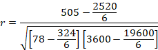
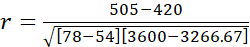
Step 4: Make a Decision about the Null
Reject the null. Since the value we computed in Step 3 is larger than the critical value in Step 2, we reject the null.
Step 5: Write a Conclusion
There is a relationship between years spent in college and income. The more years of school, the more the subsequent income.
r2
Often times we will square the r-value we compute in order to get a measure of the size of the effect. Just like with eta-square in ANOVA, we will compute the percentage of variability in Y, that is accounted for by X.
For the current example r2 = .90, so 90% of the variability in income is accounted for by education.